Site logo

Something about anything goes here.

Which logo do you like more

1
2
15%
2
11
85%
 
Total votes: 13
User avatar
eXg. sabooya
Doom 3
Posts: 5133
Joined: Mon Feb 13, 2006 9:47 pm
Location: Ithaca, NY

Site logo

Post by eXg. sabooya »

Ok my new site is nearing completion, but i am unsure of what logo to use, so coul yall help me out and vote on one?
Image 1

Image 2
Image
User avatar
Deathr0w1
Forum Groupie
Posts: 185
Joined: Mon Aug 14, 2006 10:08 pm

Post by Deathr0w1 »

2nd 1
User avatar
hadriel
Open Roster
Posts: 2848
Joined: Wed Dec 28, 2005 8:28 am
Location: Ontario, Canada
Contact:

Post by hadriel »

#2
motionOne
Forum Master
Posts: 1106
Joined: Wed Dec 28, 2005 9:56 am
Location: the BEACH, NJ

Post by motionOne »

DIFFERENT FONT !!! IMPERATIVE
Perfect1on
Forum Elite
Posts: 941
Joined: Wed Dec 28, 2005 3:55 pm

Post by Perfect1on »

I like number 2
Specs:
Amd 4800+ Dual Core (2.41ghz)
BFG 8800gt oc 512mb
Asus M2n32-sli motherboard
WD 150 Raptor X harddrive (10,000rpm, 16mb cache)
3 gigs of Corsair XMS ram
550w PSU Antec
X-fi Fatal1ty sound blaster
User avatar
eXg. Frag///aster
Quake 4 US
Posts: 2101
Joined: Wed Dec 28, 2005 10:43 am
Contact:

Post by eXg. Frag///aster »

second for sure bro... thats sweet... I would have that be ur trademark bro..

Frag.
Image
Image
motionOne
Forum Master
Posts: 1106
Joined: Wed Dec 28, 2005 9:56 am
Location: the BEACH, NJ

Post by motionOne »

new font and new name. 'sabooya-site' is too kiddy sounding.
Smudger
Quake 4 EU
Posts: 176
Joined: Mon Aug 14, 2006 4:33 am
Location: Sweden

Post by Smudger »

Its no. 2 for me but you do need a new site name :)
Image
User avatar
eXg. sabooya
Doom 3
Posts: 5133
Joined: Mon Feb 13, 2006 9:47 pm
Location: Ithaca, NY

Post by eXg. sabooya »

[eXg]motionOne wrote:new font and new name. 'sabooya-site' is too kiddy sounding.
Not the question i asked but that's how it is when U R a kid :roll:
and i guess its kind of obvious which logo is better lolz
thx for the feedback
Image
wrath of god

Post by wrath of god »

Both look good Sab. But the 2nd one has that extra touch. I love the s and s hooking up like that.
User avatar
eXg. Pun1sher
Number One
Posts: 9283
Joined: Tue Dec 27, 2005 5:11 pm

Post by eXg. Pun1sher »

I vote 2nd.

PuN
Image
User avatar
BugZz
Forum eXtremist
Posts: 3560
Joined: Sun Jan 15, 2006 9:01 pm
Location: Oberlin,Ohio

Post by BugZz »

i voted 2nd also
[CENTER]Image[/CENTER]
dorkiz
Quake Live US
Posts: 3197
Joined: Tue Jan 24, 2006 10:31 pm
Location: SLC, Utah
Contact:

Post by dorkiz »

Maybe it's just that particular image, but I would have picked the 2nd if it didn't look so pixelated. If it was cleaner it'd definately be my choice.
User avatar
eXg. sabooya
Doom 3
Posts: 5133
Joined: Mon Feb 13, 2006 9:47 pm
Location: Ithaca, NY

Post by eXg. sabooya »

dorkiz wrote:Maybe it's just that particular image, but I would have picked the 2nd if it didn't look so pixelated. If it was cleaner it'd definately be my choice.
lolz what res is your computer at?
Image
SunTzu
Moderator
Posts: 4581
Joined: Wed Dec 28, 2005 2:00 pm

Post by SunTzu »

im sry have to say none the first to simple the second is a much used logo im even pretty confident the SS 1 is in use to

why not S2 or two S but in the way with the 2 above but bein an S

or leave out the site sonce its pretty obvious that its youre site
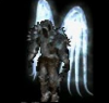
 :wink:
Post Reply

Return to “General Public Chat”